
"Red"
Graphic Designer
Have you ever surfed to a website on your computer and then tried to pull it up on your smart phone or tablet, just to discover it's all discombobulated? Then you know how frustrating it can be when a website doesn't behave the same between various devices.
This could be losing you customers.
If you're developing your own website or having someone do it for you, this little treat is for you.
"Responsive websites" are designed to ease the website development of pages so they will appear on different devices and function in nearly the same manner regardless of device (PC, tablet, smart phone...).
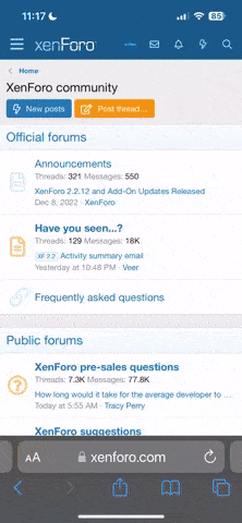
Responsinator is a website that displays any URL on several different devices. Enter your website URL in the box at the top/left corner and see how others see your website on their particular device. This will give you a quick indication if your website is being trashed when being visited by a potential customer. If there are any devices that do not display your website correctly, then it may be time to update your site to a "responsive website".
Go ahead, give it a try and see if your website looks good on all the various device examples (and yes, it really does show your website).
If you're just starting on your website, this is a good way to check it out before you go live and give you an opportunity to work out any bugs as well.
This could be losing you customers.
If you're developing your own website or having someone do it for you, this little treat is for you.
"Responsive websites" are designed to ease the website development of pages so they will appear on different devices and function in nearly the same manner regardless of device (PC, tablet, smart phone...).
Responsinator is a website that displays any URL on several different devices. Enter your website URL in the box at the top/left corner and see how others see your website on their particular device. This will give you a quick indication if your website is being trashed when being visited by a potential customer. If there are any devices that do not display your website correctly, then it may be time to update your site to a "responsive website".
Go ahead, give it a try and see if your website looks good on all the various device examples (and yes, it really does show your website).
If you're just starting on your website, this is a good way to check it out before you go live and give you an opportunity to work out any bugs as well.