

You are using an out of date browser. It may not display this or other websites correctly.
You should upgrade or use an alternative browser.
You should upgrade or use an alternative browser.
A New Yard Sign Concept
- Thread starter "Red"
- Start date
Rapid HotClean
New member
Since you asked. Bzzt!
socalkol
New member
Since you asked. Bzzt!
Please translate to english...
Chris Dubbs
Member
May be to much for a drive by.
Sent from my iPad using Tapatalk HD
Sent from my iPad using Tapatalk HD
Luis Orts
New member
It's not a bad idea... I just feel like the focal point of the sign is the phone.
When really, it should be a brief, obvious benefit of why someone should pick up the phone. Briefly followed by your logo and your number.
This elicits negative thoughts. People now and days are already scared to pick up the phone due to technology, and you just reinforced it.
Good efforts my man, but keep trying.
Rapid HotClean
New member
Please translate to english...
Translation:
Keep it simple and easy to read. Sign says what you do - Pressure Washing or Roof Cleaning etc. BIG PHONE NUMBER.
You guys are trying to reinvent the wheel and it won't work.
Doug Rucker
Roundtable Host 2009
no one cares who you are...until they know what you can do for them...
DJ Carroll
Member
here is one for my aviation company:
https://www.dropbox.com/s/ihkro8qxx8zzche/2014-06-30 15.15.44.jpg
I believe in keeping it simple as well...
https://www.dropbox.com/s/ihkro8qxx8zzche/2014-06-30 15.15.44.jpg
I believe in keeping it simple as well...
Napa Valley Steaming
New member
I like it. Its worth a shot and who knows you might create a little buzz around town and get some calls.
Andy Hinson
New member
Me no like.

GrassButler
New member
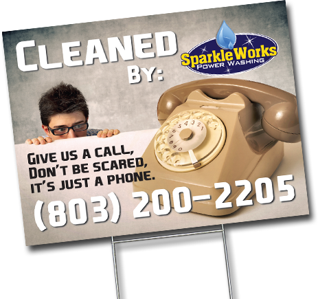
What do you think?
I can just see the line outside the customers door wanting to get their "Free OBAMA PHONES"!!
Christopher
Moderator
What is this supposed to be for? I don't understand the sign.
WASH-IT H.B.
New member
When I looked at it I thought “this Sparkle Works outfit must be cleaning telephones”What do you think?
Guy Blackmon
Roundtable Host 2009
I think it's thought provoking.......it would work well if your "Brand" is already well known, not so much if it's not.
Cool!!!
Cool!!!